When you step into a new home, the first thing you feel is its mood. Some homes feel calm the moment you enter. Some feel energetic. Others feel oddly heavy even when everything looks perfect. Many Indian homeowners link this feeling to colour choices. In cities like Bangalore, where people invest deeply in their dream homes, colour decisions often carry emotional meaning as well as aesthetic value.
Vastu guidance helps you choose shades that support comfort, positivity, and balance. If you are moving into a premium residence or exploring luxury apartments in Bangalore, understanding the right palette can help you shape a space that feels peaceful from day one.
What is Vastu Shastra?
Vastu Shastra is an ancient Indian design philosophy that connects architecture with the flow of natural energy. It links directions, elements, and spatial planning to well-being and harmony. Colours play a strong role in this system because each shade reflects a specific vibration.
Choosing the right tones can influence mood, productivity, relationships, and even restfulness within a home. Many modern homeowners still draw on these ideas when selecting Vastu colours for their homes, blending tradition with contemporary design choices to create balanced living spaces.
Tips to Choose the Perfect Vastu Colour for Your Home
1. The Living Room – For Creating a Positive and Welcoming Effect
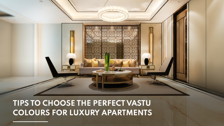
Your living room often sets the tone of the home. It is where guests arrive, and conversations begin. According to Vastu, warm and light shades work best here because they encourage openness and comfort. Cream, soft yellow, beige, or light earthy tones create a grounded atmosphere while still feeling elegant.
If your apartment receives natural sunlight, pale greens or muted blues can also enhance a sense of calm. Avoid overly dark shades that absorb light and reduce warmth. A thoughtfully chosen palette helps the space feel lively yet refined, making social gatherings feel natural and relaxed without overwhelming the senses.
2. Vastu Room Colours for Pooja Room
The pooja room carries spiritual importance. Colours here should support clarity and serenity. White remains one of the most recommended shades because it reflects purity and stillness. Soft yellow also works beautifully as it symbolises wisdom and positivity. Pale orange tones may enhance warmth while maintaining devotion-focused energy.
Try to keep finishes simple rather than glossy. Gentle lighting paired with subtle shades strengthens the sense of calm. When this space feels light and peaceful, daily rituals feel more centred and meaningful. The goal is to create an environment where your mind settles easily as soon as you sit for prayer.
3. Consider Green Colour for the Entrance Area
The entrance influences first impressions and the flow of energy. Vastu often links green with growth, renewal, and prosperity. Using green accents near the doorway, such as wall panels, planters, or décor, can create a welcoming transition from outside chaos to indoor calm. Lighter greens feel refreshing and work well in apartments with limited entry space.
This colour also blends easily with wood, stone, and neutral finishes, making it suitable for contemporary homes. When the entrance feels fresh and open, the entire home tends to feel inviting. Even a subtle hint of green can create a psychological sense of comfort and arrival.
4. The Bedroom – Create a Restful and Stress-Free Energy
Bedrooms should encourage relaxation. Vastu suggests shades that soften the mind and reduce stimulation. Pastel blues, muted greens, light lavender, and soft beige tones help create a soothing environment. These colours reduce visual intensity and support restful sleep. Couples may also prefer peach or soft pink tones, which are believed to nurture warmth and emotional connection. Avoid bright red or neon colours as they may disrupt calmness.
In luxury apartments, layered textures, soft lighting, and subtle wall tones often work best. The idea is to design a retreat where your body unwinds easily at the end of the day.
5. Blend Lighter and Brighter Colours for the Kitchen
The kitchen symbolises nourishment and energy. Vastu connects this area with the fire element, which means warm shades work well when balanced correctly. Light yellows, peach tones, or soft orange hues can create vibrancy without making the space feel intense. You can pair these with neutral cabinets or natural stone finishes to maintain a sense of sophistication. Avoid heavy, dark shades that absorb energy and reduce brightness.
A balanced kitchen palette helps the space feel lively yet organised. When colours support warmth and clarity, everyday cooking feels more enjoyable, and the space feels naturally active.
6. The Study or Home Office – To Encourage Focus
With remote work becoming common, study areas need supportive colours. Vastu recommends shades that sharpen concentration while keeping the mind calm. Light green is widely preferred because it represents balance and growth. Cream and pale yellow also support clarity and steady focus. Avoid overly bold colours that may distract the eye.
In premium homes, combining soft walls with wooden textures often works well. This pairing creates a sense of stability and professionalism. When the study environment feels composed, productivity improves naturally and long work hours feel less draining.
7. Opt for Light Colours for Ceiling and Staircase
Ceilings influence how spacious a home feels. Light shades such as white, off-white, or very pale grey help reflect light and create a sense of openness. Staircases also benefit from similar tones as they maintain visual continuity between floors. Dark ceilings can make spaces feel compressed, especially in apartments. Light shades support brightness and movement, which Vastu associates with positive circulation of energy.
In luxury residences, these neutral tones also complement modern design elements like glass railings, marble flooring, and subtle lighting. A lighter upper palette helps your home feel airy and visually balanced.
8. Steer Clear of Dark Colours for the Prayer Room
Dark colours in prayer spaces may feel visually dramatic, but are often discouraged in Vastu. Deep tones can reduce the sense of serenity needed for meditation. Instead, keep the palette gentle and uplifting. Whites, soft creams, and light yellows maintain spiritual focus and openness.
If you want contrast, introduce it through décor rather than walls. Subtle lighting, brass accents, and natural materials can add richness without disturbing calmness. Maintaining brightness in this space ensures it feels peaceful every time you enter, helping you connect more easily with your daily rituals.
Conclusion
Choosing the right Vastu colours for your home blends emotional comfort with traditional wisdom. A thoughtful palette can shape how you feel in each room, from peaceful bedrooms to welcoming living spaces. If you are exploring the best colour for your home as per Vastu, remember that harmony often comes from balance rather than strict rules.
At One Bangalore West, homes are designed to offer both elegance and flexibility so you can create spaces aligned with your lifestyle and beliefs. If you are considering luxury apartments in Malleshwaram, Bangalore, visiting the property in person can help you visualise your ideal home. Your perfect space often begins with the right feeling the moment you walk in.